I needed to create a series of diagnostic plots for a recent Data Mining project. I created the plots by hand using R — I say "by hand" to mean that I wrote a script to generate them, rather than using a tool such as Tableau. The reason is that the data for the plots came from the UCI Machine Learning Repository, and it just so happened that the particular dataset (iris) come bundled with the R standard library. :)
I added the script code to my Visualization repository in GitHub, but below you can find some of the output images that the script generates:

Parallel Coordinates with ggplot2.

Correlation matrix plot with the 'corrplot' package.
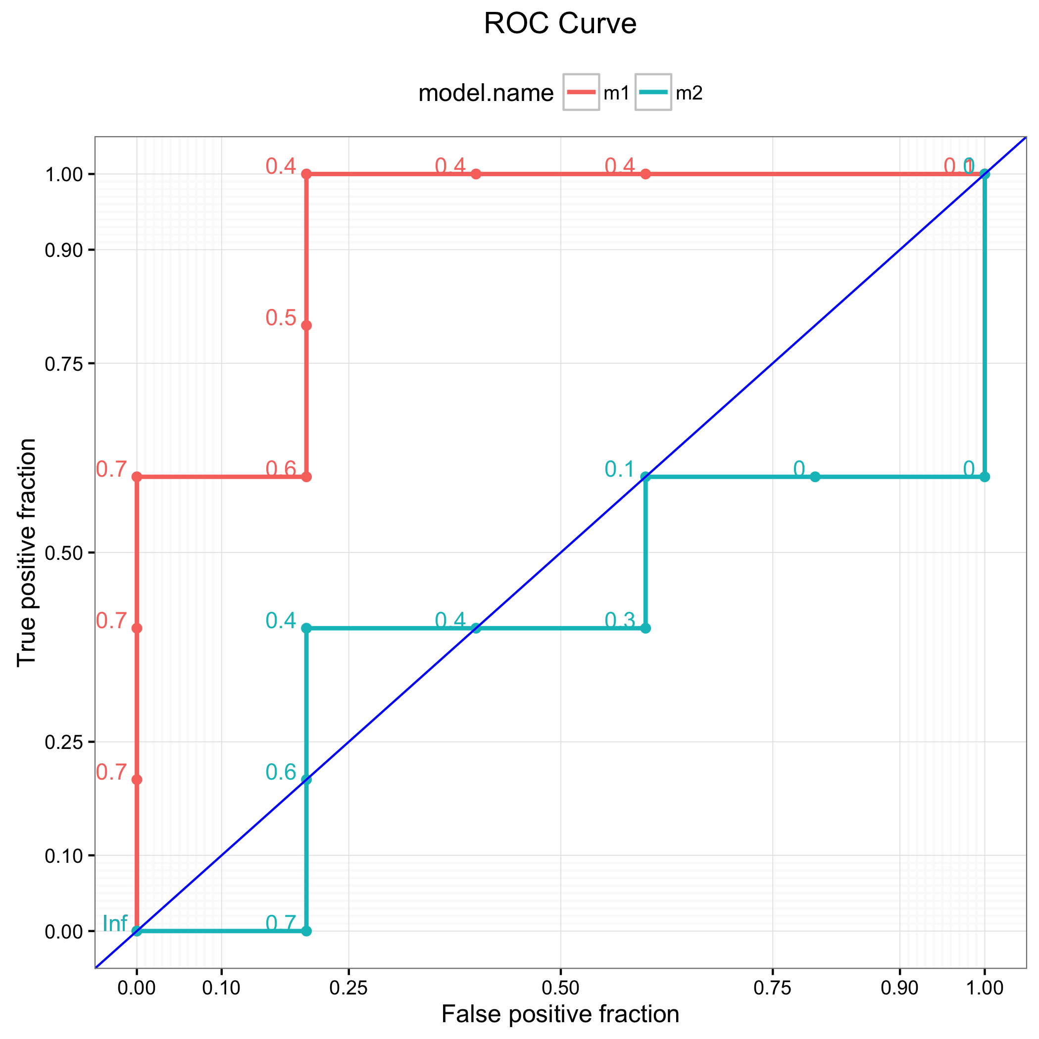
ROC curve with ggplot and plotROC.

ggplot histogram with density curve.
The script also generates Box Plots and Scatter Plots, and creates PDF and PNG output files.